Ansible Modules Contribution Structure
Time for more Ansible content! There’s a lot of talk about “collections” in the Ansible community at the moment, and rightly so. It’s a big change, and it needs to be done right - so I’ve been working on some analysis of our community to understand how to make this as smooth as we can. In this post, I’ll take you through what I’ve learned so far….
What’s the goal?
Collections will require us to carve up the existing
lib/ansible/modules
directory into smaller separate repositories. We need to decide how that’s going
to be done. In other words:
How does contributor activity influence collection design?
While logical grouping of modules will determine much of the separation, we
should also consider the cost to the community. If we cause a lot of extra admin
or large changes to workflow, then we will lose many contributors. Forcing a
contributor to commit to 5 new repositories instead of just
ansible/ansible would not go well. For
those of you that have been contributing to Ansible for a long time, you may
remember pain when tests and modules were in separate repositories
(ansible/ansible-modules-extra and ansible/ansible respectively).
Thus, I think it makes sense to examine the contribution patterns in
ansible/ansible over recent time. We’ll study the commits found in the git log for Ansible, filtered by:
- Only the commits in the last 2 years (up to 2019-11-04)
- Patterns change over time, plus there was a mass migration about 3 years ago
- Excluding commits from core-team folks
- They will already be contributing in otherwise abnormal patterns due this being their job
- Only commits which touch
/lib/ansible/modules/- That is, commits which contain changes to at least one file in this sub-directory
Caveats
This leads to the caveat that we will not see any PRs that were not merged due to being too complex or touching too many directories. A quick scan suggests this is not a common occurrence.
Analysis Method
Let’s first define some terms:
- TLD / topdir - the top-level directory under
/lib/ansible/modules- e.g. ‘cloud’ - MLD / moddir - the module directory under the TLD - e.g. ‘amazon’
- File - the module file itself in the MLD
- Collectively, we’ll call these three things an Object as shorthand
- Commit - a unique SHA ref in the git log
- Author - the name of the user who authored the Commit
We will now examine:
- Summary data on frequency with which a Commit/Author touches N TLDs/MLDs/Files
- Commit/Author breakdown across the directory tree as a flow (Sankey) diagram
- Network graphs of the relationships between directories
Frequency of commits
A natural starting point is to ask the question:
How often does a contributor commit to multiple places?
This makes sense because we want to minimize workflow changes, so understanding how often contributors commit in multiple places will help.
To do this, let’s construct a histogram. We’ll count how many times a contributor, over the 2 year period, commits to a given Object. We do this over all time rather than per-commit because there are relatively few single commits that touch multiple places - rather, we want to know if today a contributor is working in “cloud” but last month they were adding to “crypto”.
Here’s our histogram:
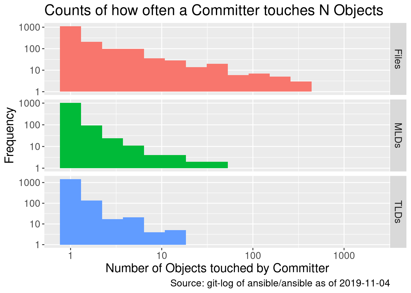
Right away we see a few things. As we would expect, contributors touch more files than MLDs, and more MLDs than TLDs. This makes sense because, of course, it’s a tree structure - but it’s a nice check on our maths.
More interestingly, we see that in all cases, 1 is the most frequent number of Objects to commit to - and because this is a logarithmic scale (\(log_{10}\)), it’s a lot more. We very quickly get into a long tail of higher counts.
The next question we might ask is:
What value of N objects covers a large part of the community?
In other words, what value of N means most of the community commit to N objects or fewer over the last 2 years? We can solve this by turning the above histogram into a cumulative frequency plot:
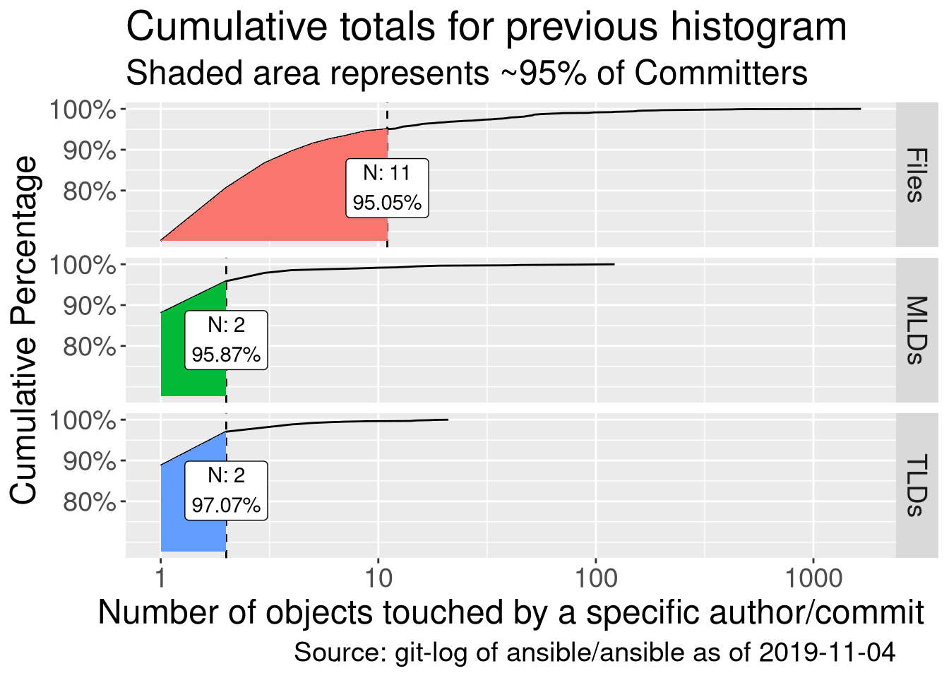
Now we’re getting somewhere. I’ve gone with 95% here as that seems like a sensible target (there are 1637 authors, so 82 would not be covered here). We see that within this 95%, only 1-2 TLDs and MLDs are committed to. We can table that:
| Object | N touched | Count | Cumulative Percent |
|---|---|---|---|
| MLDs | 1 | 1045 | 88.04% |
| MLDs | 2 | 93 | 95.87% |
| TLDs | 1 | 1453 | 88.76% |
| TLDs | 2 | 136 | 97.07% |
So now we see just how many people only commit to a single TLD or MLD - that’s very reassuring when it comes to splitting off collections into smaller parts. Of course, we shouldn’t only consider this, as active maintainers in the top 5% of the cumulative graph are really important - but at least we’re not breaking things for everyone!
Commit quantity - structure by TLD
As a brief aside, let’s take a quick look at the commit flow - we know that we have the same values of N for MLDs as for TLDs (i.e. committers general touch 1 or 2 in either case), so for large TLDs, it might make sense to chop it up at the MLD level. A Sankey plot is helpful here (due to space considerations, I’m not going to expand out the MLDs, but see the end of this post for an interactive version):
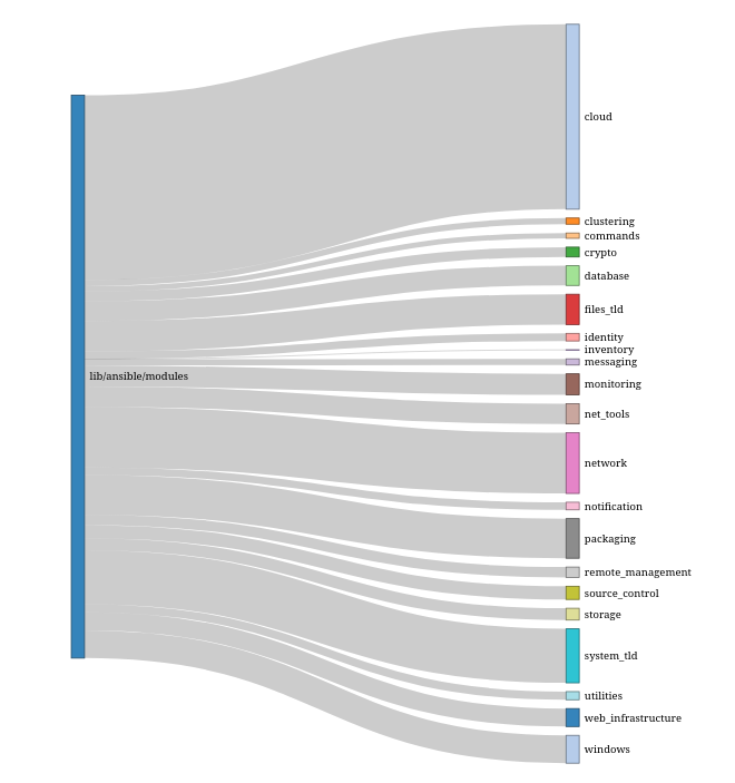
I don’t actually think this shows us much new - indeed, one could just write a table of the number of authors in each TLD. However, it does make very obvious just how large “cloud” and “network” are, as well as a few others - these might make more sense to be broken up at the MLD level.
Directory pairs
One final question that we should explore is:
Where people contribute to >1 Object, is there a pattern to which objects are committed to? Is it always the same pairs of objects?
This is interesting, again, because of workflow. Knowing that people contribute to mainly 1-2 Objects is not enough - if committers regularly work on TLDs A & B over other possible pairings, then there’s an argument for not breaking those two up. In other words, is there related content that makes sense to be grouped together?
However, we only have commit data, so we need to construct a metric by which to “link” a pair of directories. I’m going to use the concept of “distance” or “strength” here, specifically Euclidean Distance which means the metric is \(\sqrt(x^2 + y^2)\). So for a single committer \(i\) we have:
\[Strength^i_{A,B} = F(x = commits^i_A, y=commits^q_B) = \sqrt(x^2 + y^2)\]
So, we can calculate this “strength” over all possible pairs of directories \(A\) and \(B\). This gives us a set of “strengths” for committer \(i\) - we can then calculate this for all committers, and take the mean. Which results in a network graph - where strong links suggests directories that are commonly committed to. Here’s an example for the TLDs:
| x | y | strength |
|---|---|---|
| inventory | network | 849.00000 |
| inventory | windows | 268.00000 |
| inventory | system_tld | 53.50000 |
| commands | network | 51.26316 |
| clustering | network | 49.50000 |
| messaging | network | 45.00000 |
| identity | network | 39.42593 |
| inventory | storage | 36.00000 |
| crypto | network | 32.17143 |
| inventory | net_tools | 28.00000 |
| inventory | packaging | 26.50000 |
| database | network | 23.54286 |
| inventory | monitoring | 20.00000 |
| inventory | web_infrastructure | 20.00000 |
| inventory | remote_management | 16.00000 |
Firstly, there’s a pretty huge outlier in the first two rows (it turns out this is due to Dag, who’d have thought :P). So let’s filter those, and then plot links > 10.
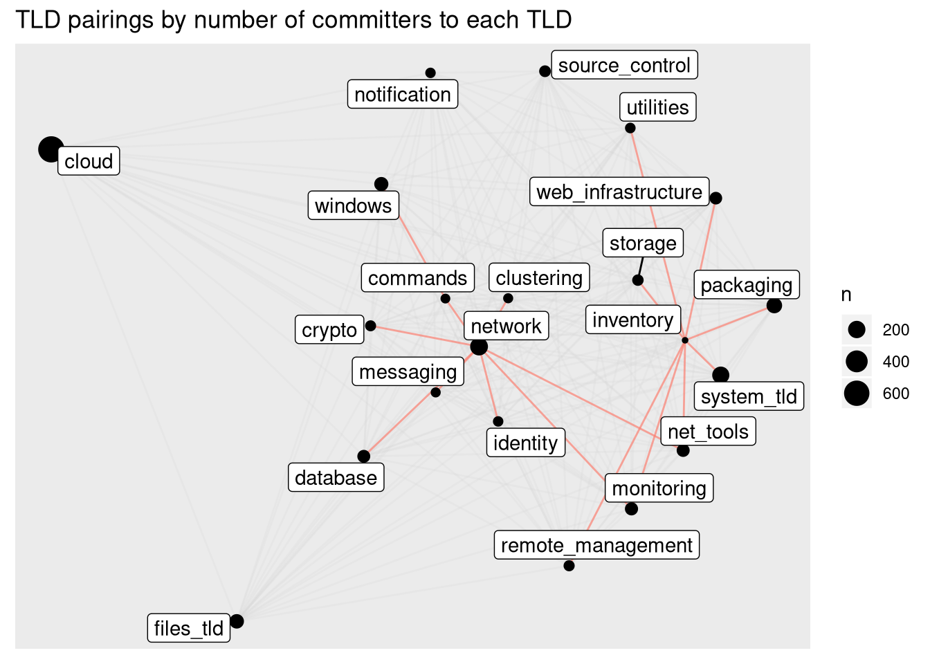
OK, now we’re seeing something good. The TLDs are plotted using the “strength” to determine their spacing - the closer they are to each other, the more strongly they are related. The size (radius) of the node is the number of committers to that TLD. I’ve picked out some of the strongest links in red, and plotted the others with a high transparency so they don’t clutter up the graph.
We can see some patterns between groups of directories here - patterns of directories that people commonly commit to in clusters. Interpreting which of these might genuinely belong together is beyond me, though, as I’m no expert in the Ansible modules themselves - I’ll leave that to Gundalow! Also interesting is that “cloud”, one of the largest TLDs, is miles away from the rest - good news for separating that huge TLD out.
If you want to explore this more, or for a MLD, check out the interactive version in the link below.
Conclusions
It seems that the contribution patterns within lib/ansible/modules are largely
that of individual contributors staying within 1-2 areas that they know well -
and that the pattern of which 2 areas (when it’s 2) is largely random. Thus,
when designing which modules go into which collection, we should not have too
much trouble.
Interactive version
If you’d like to play around with this data set, and also look at it through the medium of commits rather than committers then check out the dashboard at https://stats.eng.ansible.com/apps/collections_structure/ - there’s live versions of these graphs, and if you find anything interesting, let me know!