Ansible Community Data Analysis: Part 1
Who am I?
If you’re new to the blog, let me say hi. I’m the Community Data Scientist within the Ansible Community team - which is a fancy way of saying that I explore the data generated by the Ansible community. I then use it to create tools that my colleagues can use to help do their work better.
In this series, I plan to go over the tools I create, how they work, what they represent, and how the results inform further decision making.
For this first post, we’re going to explore a very hot topic - GitHub merge times!
Defining the question
All good statistical work should start by defining the problem we want to solve. In this case, we all know that it’s taking longer to get PRs merged than it used to - but how bad is the problem? Here we want to address:
- How long does it “typically” take to merge a PR?
- Has it gotten worse over time?
- Are the specific problem areas that are causing issues?
Aside: Why averages are hard
When we think about PRs being merged, it’s natural to thing “Well, we could take an average!”. So let me slow you up there a second with this aside.
An average is a function of a vector of numbers - for example the mean is simply
the sum of the numbers divided by the length of the vector, e.g. (1+2+3+4)/4
is 2.5.
But! What if some of the values are missing (i.e. NA)? This complicates things
- we cannot add NA to our total, so (1+2+3+NA) is meaningless. We could, of
course, drop the NAs, but this distorts the average (now we have (1+2+3)/3
which is 2). If the sample size is decent, and the NAs are randomly distributed,
this is actually a decent approach.
However, if they’re not random? If the numbers in our example so far represent
“number of days old” for a given PR when it’s merged, then we can see that any
PRs which are still open will have an NA value. Since it’s not merged, we
cannot know the age when it’s merged (if it ever is) - but we can say it must be
at least $today - $date_created days old.
In other words, when we exclude open PRs from our averages, we deliberately distort the true value of the mean - and it’s likely to be undervalued (although we can’t be sure). This is a major problem, in my opinion - when a community reports that “our average PR/bug/issue time is 4.6 days”, I know that’s likely not to be true. So what do we do?
Survival Analysis to the rescue!
I’m not going to go into the mathematics of survival analysis here (you can read about it on [Wikipedia])(https://en.Wikipedia.org/wiki/Survival_analysis) if you wish) - what’s important is that it allows us to account for the still-open PRs in a rigorous way.
The result is a model which describes the chance of a PR still being open after X days, which we can plot - here’s an example:
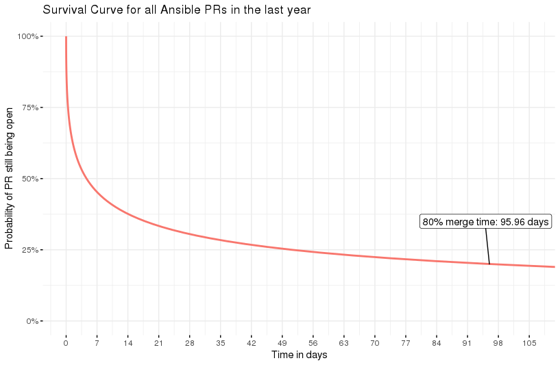
Survival curve for 1 year’s wotth of Ansible PRs
This is for all the PRs merge (or still open) in the last year - all 10713 of them (wow, we’re busy!). We can think of the 50% line as being something similar to a median - and here we see that’s around 4 days, which is not bad!
However, I think the 80/20 rule applies here - we’d like to say that 80% of our PRs are merged in a good time frame. And so I’ve marked that number of the graph, 96 days. Ouch. More interestingly, the shape of the curve helps us to see the falloff - after about 67% of PRs are merged, the time-to-merge starts to go drastically up.
So, we’ve answered our first question - for whatever your meaning of “typical” is, this curve will tell you the “typical” merge time. Good start!
Has it gotten worse?
In the above exercise, we took all the PRs in the last year, and reduced it to one number of interest (the 80% merge time, 96 days). However, we have access to all the data on GitHub, so it’s possible to do these calculations from a previous time (i.e to only work with PRs relevant to that time period). We could, for example, take a 1 year period from 1 month ago, 2 months ago, 3 months ago, and so on…
Suppose we do that, and for each set of PRs, we again calculate the 80% merge time. That gives us a scatter plot of date vs merge time, and it looks like this:
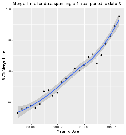
Scatter plot of merge times with-resperct-to date, increasing month on month
So now we’ve answered question 2 - is it getting worse? Yes, for sure, and it seems to be accelerating. We have work to do!
Finding the hot spots
So far we’ve done exploratory work - we now have numbers that quantify the problem, and a way to see if it’s improving. But we need to know where to look!
One way to look at this is to model survival curves for PRs with a specific GitHub label, and compare them to other labels. For example, we might look at a particular working group:
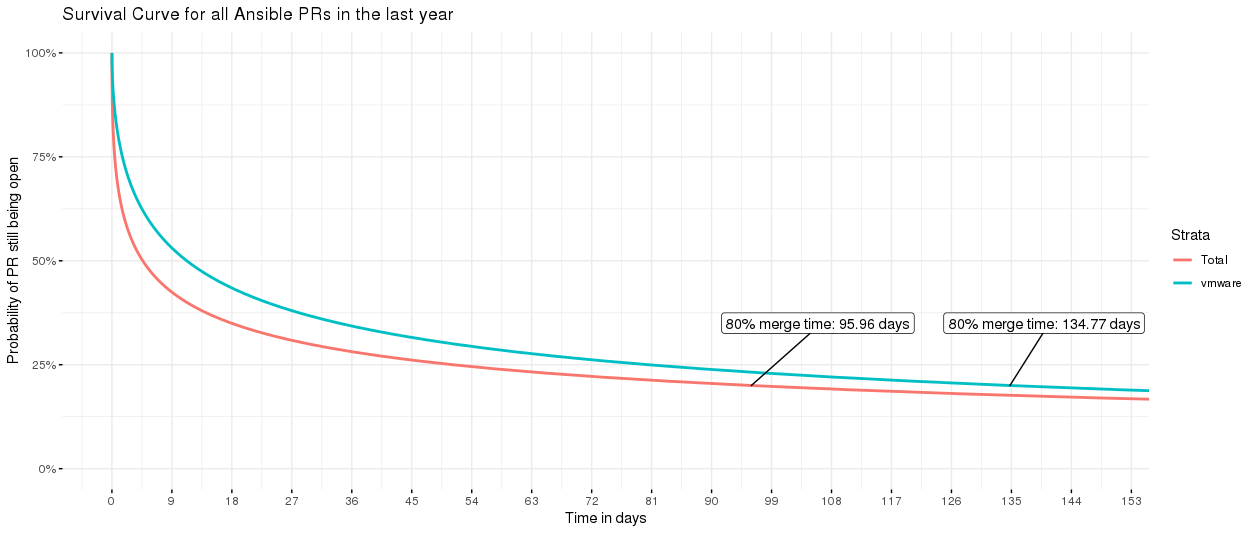
survival curves for all PRs vs VMware PRs
Uh oh! Looks like VMware might need a little help - the curve for that working group is higher than the total of all PRs (stats note: the “all PRs” includes the VMware PRs too). Or perhaps we’d like to check if bugs in the latest version are getting appropriate attention:
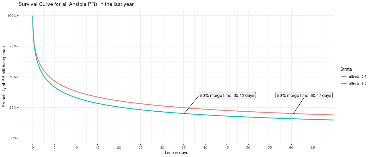
bugs affecting 2.7 and 2.8, 2.8 is going faster
Indeed, yes - bugs affecting 2.8 are going nearly twice as fast as those affecting 2.7.
This can be replicated for every label in GitHub, and allow for a nice table of results so people like Gundalow can reach out to the right people to unblock things.
Is this a one-off analysis?
Heavens, no! I just didn’t want to introduce you to the live version until you knew what you were seeing :)
If you’d like to have a play with these curves yourself, please head over to the Ansible Merge Time Explorer where you’ll find live versions of the plots I’ve shown here (refreshed weekly). Please be nice, though, it’s not a powerful server :)
If you find anything interesting, let me know! I’m also working on a new version of this app, with more useful details - I’ll be sure to post about it when it’s done.