Visualising the community contributions to Ansible Modules
Let’s start with defining the question - today, I’m tasked with showing the patterns within the modules relating to where there are high levels of staff commits (i.e people employed by Red Hat within Ansible itself), and everyone else (which we’ll label ‘community’). Note that ‘community’ will still include some Red Hat folks, as we’re a big company and not everyone works on Ansible for the $day-job (there’s a caveat to this, see Appendix 1)
The resulting graphic, as you’ll see, largely speaks for itself, so here it is! Sometimes, a picture really is worth a thousand words…
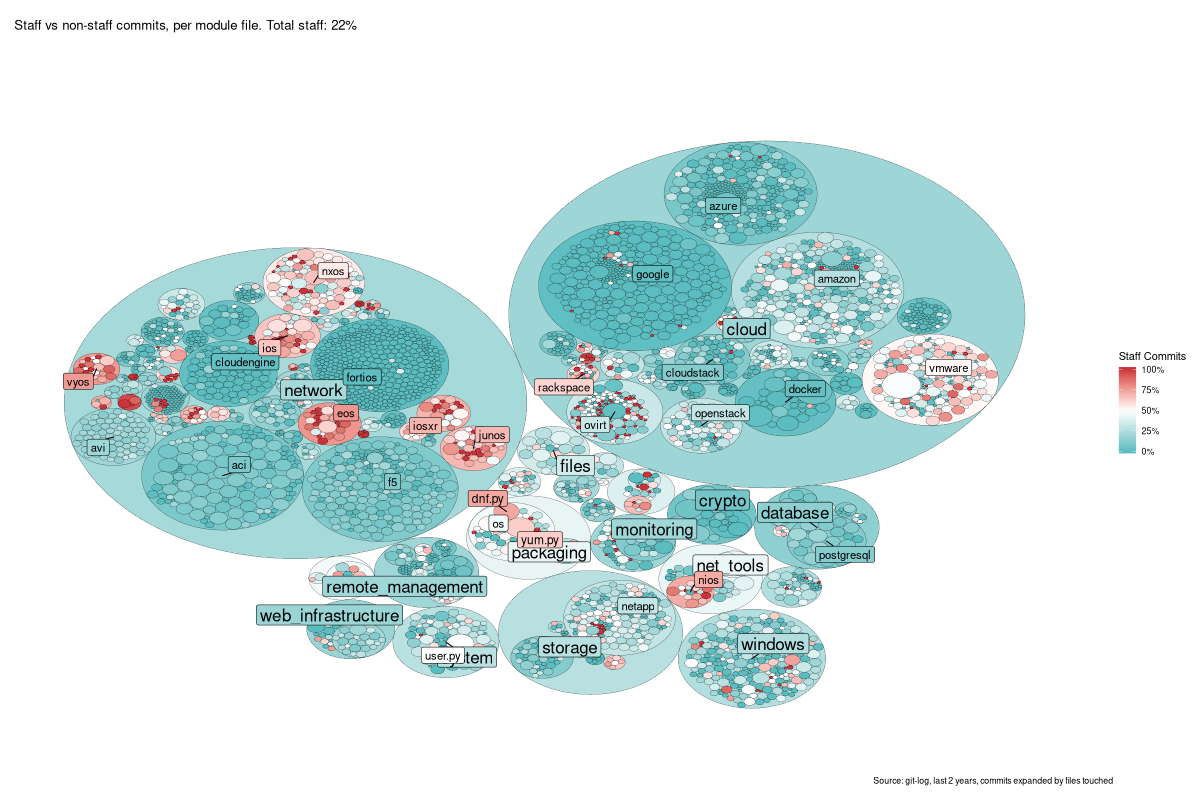
This is a tree-map - each small circle is a single file in
/lib/ansible/modules, and then the larger circles around them are the
containing directory, and so on up the tree. The size of the file-circles
only is determined from the total number of commits to that file.
I really like this result - apart from the non-colourblind-safe palette of
red/blue (I was finding it hard to make a clearer one). It’s a lovely graphic
that tells a high-level story at a glance (lots of entirely community-created
modules), and some more niche tales as you dive in (e.g. look closely at
vmware…).
So, done? Nah, I don’t write short posts - so, for a change, I’m going to dive into the R code I used to create it, so you can mess about with it yourself :)
Part 0 - Libraries
We need some packages, so I load them here. My greglib package has my staff
list in it, so you’ll need to create one of those for yourself if you’re
following along :P
library(tidyverse)  # data manipulation
library(greglib)    # staff list
library(ggraph)     # graphing tools
library(igraph)
library(data.tree)  # tree mapping tools
library(git2r)      # git cloning
# remotes::install_github('lorenzwalthert/gitsum')
library(gitsum)     # nice log parsing tool
set.seed(1234)
Part 1 - The Data
We’ll need some data, of course. We could use a variety of metrics to determine
“contributions” or “content”, but I’m going to keep it simple. We’ll git clone
Ansible, and look at the raw Git log itself. We’re going to restrict this to the
last 2 years of data - if less, we don’t get more than 1 commit to many files;
if more, it’s not representative of the current community.
# Clone if we need to
if (!dir.exists('/tmp/ansible')) {
  git2r::clone('https://github.com/ansible/ansible','/tmp/ansible')
  # Get detailed data on each commit - takes a few min :)
  gitsum::init_gitsum('/tmp/ansible/', over_write = T)
}

logs <- gitsum::parse_log_detailed('/tmp/ansible/')

# Filter to commits within date & touching /lib/ansible/modules
commits <- logs %>%
  filter(date > Sys.Date() - lubridate::years(2)) %>%                # 2 year date filter
  unnest(nested) %>%                                                 # unpack commits to one-row-per-file-changed
  filter(str_starts(changed_file,'lib/ansible/modules/')) %>%        # detect the commits to modules
  filter(!str_detect(changed_file,'=>')) %>%                         # drop rows with are just renames
  mutate(changed_file = str_remove(changed_file,'lib/ansible/')) %>% # tidy up the filename, everything is in lib/ansible
  mutate(staff = author_name %in% greglib::staff$gitlog.name)        # note staff vs community commits

# Preview it
head(commits) %>%
  arrange(short_hash) %>%
  select(short_hash,date,staff,changed_file) %>% # just picking a few columns to display
knitr::kable()| short_hash | date | staff | changed_file |
|---|---|---|---|
| 9f86 | 2017-12-19 12:22:00 | TRUE | modules/network/nxos/nxos_aaa_server_host.py |
| 9f86 | 2017-12-19 12:22:00 | TRUE | modules/network/nxos/nxos_bgp.py |
| 9f86 | 2017-12-19 12:22:00 | TRUE | modules/network/nxos/nxos_bgp_neighbor.py |
| 9f86 | 2017-12-19 12:22:00 | TRUE | modules/network/nxos/nxos_bgp_neighbor_af.py |
| 9f86 | 2017-12-19 12:22:00 | TRUE | modules/network/nxos/nxos_facts.py |
| 9f86 | 2017-12-19 12:22:00 | TRUE | modules/network/nxos/nxos_gir.py |
OK, so we have a nice data frame, one row per changed file with supporting data. Lovely.
Part 2 - Tree Maps
The best way to work with this data is to use a tree map, since it is actually a tree - a directory tree to be precise. Here, we’ll turn our data frame into a tree, and add the data we know about to the leaf (file) nodes.
tree <- commits %>%
  group_by(changed_file) %>%
  summarise(n = n(),                      # total commits to this file
            staff = sum(staff),           # commits from staff
            perc_staff = staff/n          # percentage of staff commits
  ) %>%
  rename(pathString = changed_file) %>%   # renaming makes later code cleaner
  FromDataFrameTable()                    # create the tree

print(tree,'staff', limit = 7)
## levelName staff
## 1 modules NA
## 2 ¦--cloud NA
## 3 ¦ ¦--alicloud NA
## 4 ¦ ¦ ¦--__init__.py 0
## 5 ¦ ¦ ¦--_ali_instance_facts.py 0
## 6 ¦ ¦ ¦--ali_instance_facts.py 2
## 7 ¦ ¦ °--... 2 nodes w/ 0 sub NA
## 8 ¦ °--... 41 nodes w/ 1680 sub NA
## 9 °--... 20 nodes w/ 4561 sub NAOK, we have leaf data, but notice that the parents (directories) are NA - we
need to aggregate the per-file data. We can traverse the tree from the bottom
upwards to get at this.
tree$Do(function(x) {
  if (!isLeaf(x)) { # no need to act on leaf nodes, it's defined there already
    x$n     <- sum(Get(x$children, "n"))       # sum of commits in the dir
    x$staff <- sum(Get(x$children, "staff"))   # sum of staff commits
    x$perc_staff <- x$staff / x$n              # percentage for this dir
  }
}, traversal = "post-order")                   # post-order means leaf-first

print(tree,'staff', limit = 7)
## levelName staff
## 1 modules 4693
## 2 ¦--cloud 1515
## 3 ¦ ¦--alicloud 5
## 4 ¦ ¦ ¦--__init__.py 0
## 5 ¦ ¦ ¦--_ali_instance_facts.py 0
## 6 ¦ ¦ ¦--ali_instance_facts.py 2
## 7 ¦ ¦ °--... 2 nodes w/ 0 sub NA
## 8 ¦ °--... 41 nodes w/ 1680 sub NA
## 9 °--... 20 nodes w/ 4561 sub NABoom, we have have all the data in the right format. But we will want an extra
column for the display side of things - I want the directory labels to be sized
based on their tree depth (i.e. amazon should be smaller font than cloud)
tree$Do(function(x) {
  x$label_size <- case_when(
    x$level == 2 ~ 6,             # size 6 for top-dirs
    x$level == 3 ~ 4,             # size 4 for module dirs
    TRUE ~ NA_real_               # don't label "modules" or filenames (level 1 & 4)
  )
}, traversal = 'post-order')
OK, we have a tree. Let’s plot it!
Part 3 - Edges & Nodes
To plot this, we’ll need to consume it as a network - that is, a list of
points(vertices) and the connections between them (edges). For a tree map,
that’s just the list of directories & files, and the name of the parent (e.g.
there is an edge from modules to modules/cloud, and so on).
Happily, data.tree has functions for that! The edges are trivial.
edges <- ToDataFrameNetwork(tree,'pathString')The vertices are a little trickier, as we want to preserve all the attributes
like staff_perc and so on. Also, the data.tree method for vertices would
only give the leaf vertices, so we have to be a little clever - we use the list
of to names in edges and merge data to that. It’s gnarly but it works:
# get data from the tree in a data.frame format
myverts <- tibble(name       = tree$Get('pathString'),
                  n          = tree$Get('n'),
                  perc_staff = tree$Get('perc_staff'),
                  # Style
                  label_text = tree$Get('name'),
                  label_size = tree$Get('label_size'))

vertices <- edges %>%
  select(-from) %>%                                      # use the `to` column for names
  add_row(to = 'modules', pathString = 'modules') %>%    # nothing can point *to* "modules", so add it back
  distinct(pathString, .keep_all = T) %>%                # deduplicate the list
  left_join(., myverts, by=c("pathString" = "name")) %>% # join it to the tree data
  rename(name = to) %>%                                  # tidy up and handle NAs introduced for "modules"
  mutate(perc_staff = if_else(name == 'modules',0.5,perc_staff),
         label_text = if_else(name == 'modules',NA_character_,label_text))

head(vertices) %>% knitr::kable()| name | pathString | n | perc_staff | label_text | label_size |
|---|---|---|---|---|---|
| modules/cloud | modules/cloud | 8182 | 0.1851626 | cloud | 6 |
| modules/clustering | modules/clustering | 114 | 0.3859649 | clustering | 6 |
| modules/commands | modules/commands | 66 | 0.3030303 | commands | 6 |
| modules/crypto | modules/crypto | 352 | 0.0625000 | crypto | 6 |
| modules/database | modules/database | 520 | 0.1384615 | database | 6 |
| modules/files | modules/files | 278 | 0.3525180 | files | 6 |
OK, we have a list of vertices and edges, so we can finally plot it!
Part 4 - The Plot
First, the easy bit - we’ll create a graph object, and cache a few values for ease of use in the main call.
mygraph <- graph_from_data_frame( edges, vertices=vertices )
total_perc = tree$Get('perc_staff')[1] # row 1 == 'modules', or *all the data*
staff_filter = 50                      # These filters are arbitrary, and prevent crowding
nonstaff_filter = 200                  # the plot with labels. Adjust to suit yourself!
Right, let’s do this. One immense ggplot2 invocation coming up! This is huge, so I’ll break it down piece by piece :)
plot <- ggraph(mygraph, layout = 'circlepack', weight=n)## Non-leaf weights ignoredggraph is our main function, it’s a ggplot2 extension and is amazing. See
the GGraph website for inspiration!
The layout obviously sets us up for circle-packing, and the weight tells the
algorithm to size the circles by number of commits, n.
plot <- plot +
  geom_node_circle(aes(fill = perc_staff, colour = as.factor(depth)), size = 0.1)
Add the circles (the nodes), and use aesthetics (aes) that fill the circle by
staff_perc, colour the boundary line by depth, and make that line really
thin.
plot <- plot +
  scale_fill_gradient2(low='#5bbdc0',high='#CB333B',
                       mid = 'white', midpoint = 0.5,
                       name='Staff Commits',
                       labels = scales::percent)
This sets up the colour scale from blue to red with white at 0.5 - that is, white is where there is no strong bias towards staff or community.
plot <- plot +
  scale_color_manual(guide=F,values=c("0" = "white",
                                      "1" = "black",
                                      "2" = "black",
                                      "3" = "black",
                                      "4" = "black") )
Recall the colour is mapped to depth - this just says “map depth 1 to white,
and the rest to black” which means we don’t see a circle for all modules. I
think that looks nicer, but you can change the first entry to “black” to
compare.
plot <- plot +
  geom_node_label(aes(label = label_text,
                      size  = I(label_size),
                      filter = (perc_staff < 0.5) & (n > nonstaff_filter),
                      fill   = perc_staff),
                  repel = T)
This plots the “community” labels (perc < 0.5), using the filter of staff_perc <
0.5, and the commit filter defined above.
plot <- plot +
  geom_node_label(aes(label  = label_text,
                      size   = I(label_size),
                      filter = (perc_staff >= 0.5) & (n > staff_filter),
                      fill   = perc_staff),
                  repel = T)
And this does the “staff” labels. They’re separate label calls because they use
different filters - if you wanted a single n_filter object for both types of
label, you could simplify this bit!
plot <- plot +
  theme_void() +
  theme(plot.margin = unit(rep(0.5,4), "cm")) +
  labs(title    = paste0('Staff vs non-staff commits, per module file. Total staff: ', scales::percent(total_perc)),
       caption  = 'Source: git-log, last 2 years, commits expanded by files touched')
This final bit is just styling - setting up the look & feel, the title, etc.
OK, this plot this baby! Be warned, if you followed along, this step takes a good few minutes to process. Get a beverage :)
# save to file so we *definitely* get a big image
png('/tmp/bubbleplot.png',width=1200,height=800)
print(plot)
dev.off()
## png
## 2
Conclusion
And there you have it, one step-by-step Ansible community bubble-plot (or circle-pack) based on commits and who wrote them. Hope you enjoyed it as much as I enjoyed making it! If you did, stop by and let me know, I’d love to chat about it :)
Appendix 1 - The Identity Caveat
A caveat arises, then. To do this, you have to identify the staff members to categorize, and identity is a hard problem. To get around this, I had my excellent colleague Gundalow give me the list of folks he considered “staff”. No, I’m not going to share it with you, you can ask him :P
This does mean that if a name in the git logs doesn’t match my list, it’ll go in
the community group. That’s fine in the vast majority of cases, but if someone
updates their .gitconfig file to have a new name, I’ll lose track of them.
It’s not a big impact, I think, but something to be aware of.