Ansible Community Data Analysis: Part 2
So in the last post we took at look at the merge times for ansible/ansible. That’s valuable stuff, but it takes more than code to build a community. You’ve got to have a shared sense of purpose too, and one of the best ways to build that is in-person.
For this reason, events matter. A lot. So much that community managers often spend much of their time organising and supporting those events. In Ansible-land, we’re lucky in two ways. First, we have a large self-organising community which create many events each month (seriously, just search for Ansible on Meetup.com, it’s huge…), but secondly we also have the amazing Carol Chen to support those folks from Ansible HQ.
When I became part of the Ansible team, one of my first jobs was to help Carol with a global view of what’s happening in the Meetup space. Meetup’s UI is very focused on a single group at a time, so getting a picture of all the meetups is hard. Thus was born the Ansible Meetup Stats app!
What’s it for? (A.K.A Defining the question)
The app has a few goals:
- Show the most active and largest (not the same!) meetups easily
- Investigate opportunities for new meetups
- Track the growth of meetups
- Provide consumable reports of recent & upcoming events
There’s also a longer term goal of trying to predict which meetups might become huge (we have a handful with over 2000 members each, so trying to reproduce that is of interest). But that’s a hard problem, so it’s on the back-burner for now :)
Let’s have a look through each of these in turn.
Activity
The most natural first question when it comes to meetups is “Which ones are busy?”. The first tab shows us this in a few ways. By default, we get a bar graph:
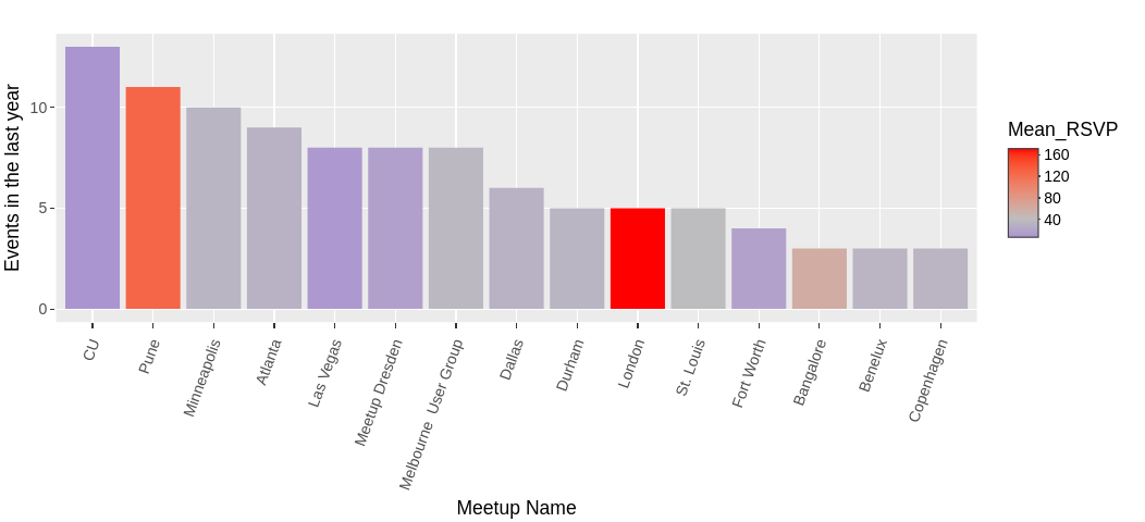
Activity bar graph
It’s important to note that activity can mean “size of meetup” or “frequency of events”, and this bar graph tries to show both. The height of the bar is the number of events in the time range (default: in the last year, see the sidebar), while the colour shows the mean RSVPs to those events.
In this screenshot, we see that the “Ansible CU” group meets frequently (13 events in one year) but has a mean RSVP of just 7. By contrast, the London group has the highest mean (171) but across just 5 events.
Neither of these things is good or bad on it’s own - depending on your task, either or both metrics may be of interest.
Event growth
Once you’ve identified one or more groups of interest, it’s natural to ask if the events are growing. A mean is a nice summary, but it doesn’t give you a direction of travel! Interactive tables to the rescue. Let’s click on a couple of groups in the table below the graph:
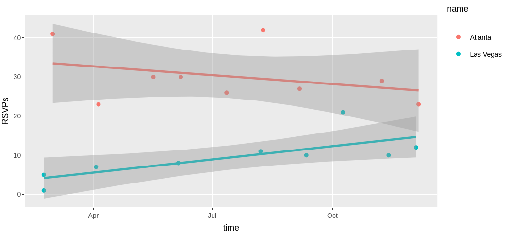
Now the chart changes to show the RSVPs for each event of the selected groups, and plots a linear fit to the data (by group). So here we see that while Atlanta and Las Vegas both have similar event numbers, Atlanta has larger-but-declining RSVPs, while Las Vegas is smaller but up-and-coming. Either could warrant more investigation!
Meetup growth
As well as what’s happening at the event level, we can also be curious about the meetup groups themselves! Membership on a website doesn’t mean a huge amount in terms of who’ll show up at events, but it’s (probably) consistent between groups for comparison.
Head over to the Growth tab, and you’ll see something like this:
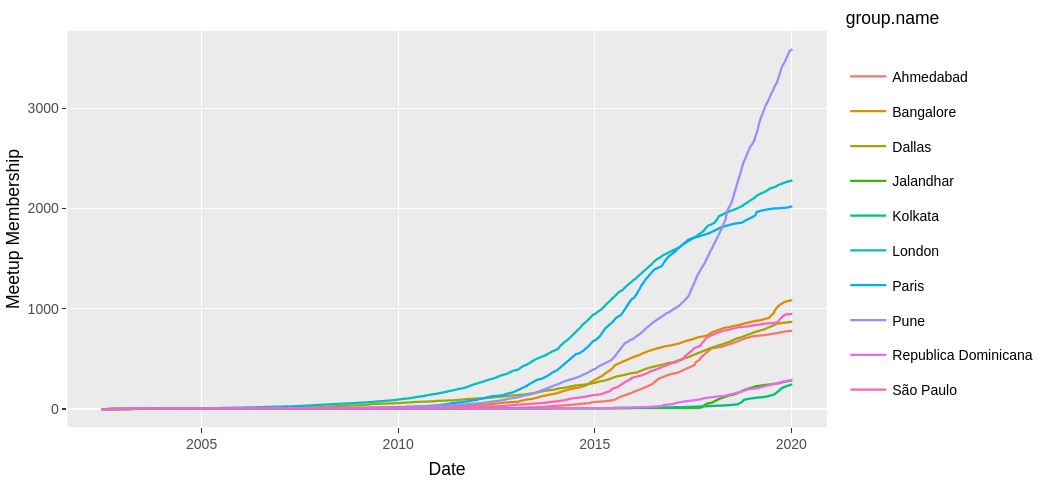
Meetup growth
Now, Meetup doesn’t actually provide historical data for the size of a group - only the number of members now (when the API call is made). So, we have to fake it a bit - we can get the date each member joined the group, and use that to build a cumulative picture. It does mean we never see people who joined and then left again later, but it’ll do. (Aside: I am now recording the membership size daily to my own data store, so we’ll be able to replace this at some point :P)
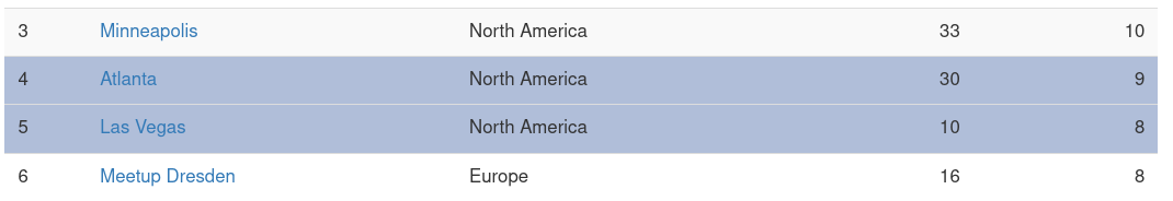
With that in mind, we can now explore the data a bit. It’s clear that we have some very large meetups, but which are the fastest-growing? If we select one in the table (as we did before), we get a new picture:
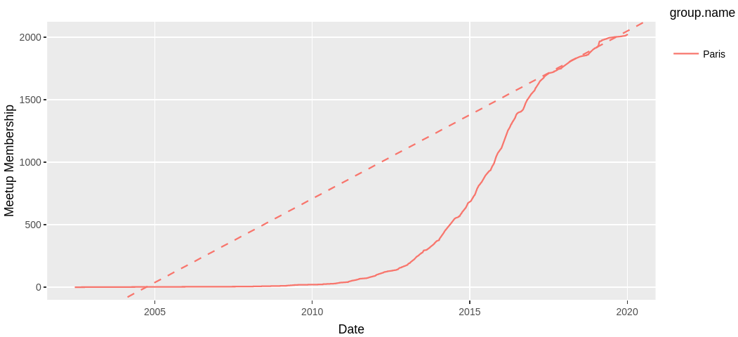
Growth linear-fit
So it’s clear that Paris had a period of rapid growth from 2013 to 2017, but has slowed down now. The dashed line is a linear fit to just the last 2 years of data - the slope of this line tells us, on average, how many new members are joining per day. This has actually been done for every group, and you see the results in the “Rate” column of the table - so we can sort by this, and get the fastest (or slowest) growing groups. Handy!
New meetups
Another question we can ask is “Where should we put a new meetup?”. I think there’s a few facets to this. We want it not too close to another meetup (people generally don’t go to more than one of the same type of event, and it leeches members from the existing event), but we also want to try and find experienced Ansible users to go. A meetup is at it’s absolute best when there’s a mix of people and skill-levels in the room.
So, how do we tackle this? Happily, Meetup.com provides the location of every meetup (well, it wouldn’t be a very useful platform if it didn’t!). We can geolocate that, and plot them, using the membership size as a radius:
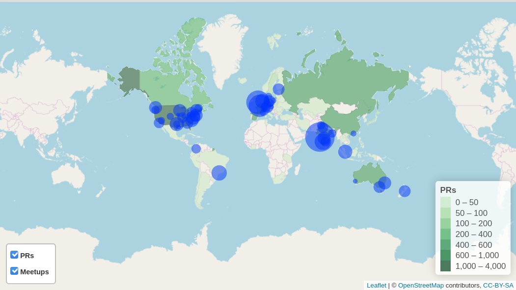
Meetup Map
But! Hold up, you say, why are some countries different colours? I’m glad you asked.
This is my attempt to show where potential experienced users might be. As you know from the previous post we hold a lot of GitHub data - including data on our contributors. Some of those contributors put a location on their GitHub profile (about 2/3rds, actually). But since I care about privacy, I’m not going to plot those exact locations - that’s not fair to our community without asking first.
Instead, I geocode the location and take only the country returned by the result. I then aggregate by country, and plot that. Unsurprisingly, the highest number of PRs comes from the USA - but there are notable others. For example, in this image, 434 PRs have come from Spain, and there’s no meetup there. A possible target, perhaps? :D
Reports
Finally, the reports tab contains some breakdowns of upcoming & past events, which is daily updated. It’s not very exciting, but if it’s useful data, feel free to bookmark it ;)
What’s that Potential tab?
Remember the hard problem of predicting “interesting” meetups? This was my first stab at it. It’s not very good, so I wouldn’t pay much attention to it :P
Wrap-up
So, that’s our Meetup app. As always, feel free to have a play - it’s built from open data taken from GitHub and Meetup, so there’s nothing special or hidden.
If you spot something interesting, do let me know! If you want to know how any of it is built, get in touch also.
Side note: Historically, this was my very first “proper” Shiny web-app, so if it looks a little different / dated compared to my newer ones, that’s why. Maybe I’ll find time to rewrite it at some point…