Community Survey Data Part 2 - Burnout
In the first post we looked at the type of data we’re dealing with. In this one, we’ll get some work done.
The Likert scale, redux
Let’s recap, for the sake of this post making sense alone. In this post, we’re interested in “burnout” and how it shows up in the rating people give the community. Remember, we asked:
“On a scale of 1 to 5, how would you rate your experience of contributing to Ansible recently?”
And the results look like this:
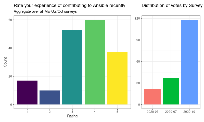
Burnout in the community
Burnout is, among other things, a matter of energy expended. We can’t measure that, and it would be subjective anyway - but we do ask:
“How long have you been using Ansible?”
That seems a reasonable proxy, as working on a project takes time, so the amount of effort expended would increase with time. It’s far from perfect, but it’s what we’ve got. So lets explore if there’s a pattern in that, with respect to the ratings. Let’s see the raw ratings data again, but subset by time now:
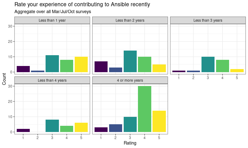
OK, that’s …something? I don’t know about you, but I can’t make much of that. If I squint a bit, maybe the 1-3 years are different to 4 / 4+? Hard to say. This is why Likert scales are hard, and why it’s so tempting to take a mean. It would be so much easier to compare the mean of each group, right?
Well, yes it would. And it might even get it right (spoiler: it does, in this case) but there’s no guarantee it would be right. And it will definitely make it hard to see how uncertain you are about the data.
Instead, we’ll model it, using Bayesian stats in R. This will allow us to treat it properly - as an ordinal category, with an ordinal predictor (although you can treat time as linear because it does have set gaps between the levels).
Models & Simulations
This is not a journal paper, so I’m not going to bore you with the model itself (but I can share if you want, get in touch!). However, I built quite a few models, and took the best of them to show you.
One of the nice properties of Bayesian models is that they are generative - that is, I can use it to generate representative data and then summarise it. In other words, what if we could survey 200,000 people, constrained that the results need to look like the data we actually have? What would we see? How certain would we be? We can simulate.
All these can be gleaned from our model, and the results can be viewed in various ways. Let’s try plotting Time and Rating together:
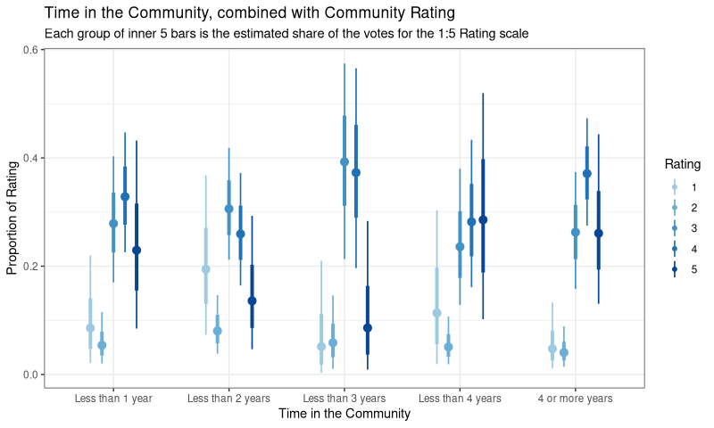
What is this?! You’re looking at the simulated share of the vote for each Time group, across the 1 - 5 levels of Rating (so each Time group will sum to 1). The points are the best guess, the bars represent uncertainty (or perhaps, plausibility).
We can definitely see an effect now - it’s clearer that the 3/4/5 ratings are far more plausible when Time is in the latter categories. But we can do even better - let’s ask the model (which generated the simulation) to spit out the coefficients for each time group:
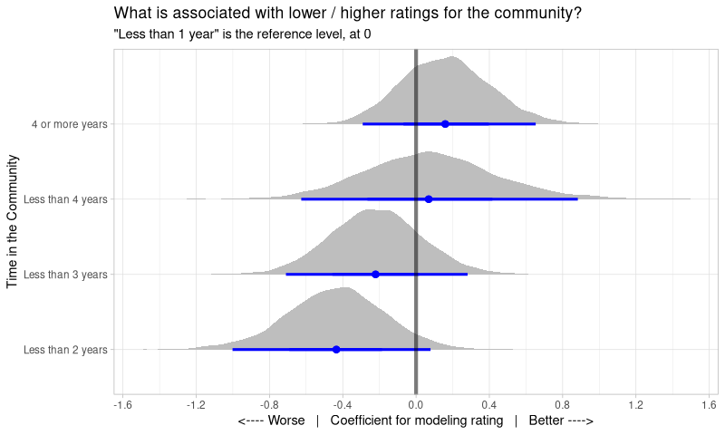
Note that “Less than 1 year” has vanished because the model has used it as a reference level - it has a coefficient of 0 by design, so I put a vertical line at zero to show it to you.
So what do we see? These are probability distributions - they show how plausible a given coefficient is within a given Time category. So relative to the Rating scores a new (less than 1 year) contributor might give us, we see that 1-2 years rates much lower, and 2-3 years is a bit lower, while “older” contributors actually recover and rate contributing more highly than new folk. However, do note that we are quite unsure of exactly how strong these relations are - the distributions show considerable possibility to values either side of the blue points.
Of all these, the “less than 2 years” is the only one with almost all the distribution away from zero. This result actually holds across a range of models I tried (6, I think), so it’s worth thinking about a bit more…
Why 2 years?
So, we appear to have an inflection point at 2 years - why? Firstly, of course, it might not be causal - this could be coincidence. However, I think there’s (at least) two possible mechanisms that might explain it.
First, the “being a human” explanation, which works for any community. When you first start contributing, its exciting! But after a year, probably not so much - dealing with tests, process, CI, docs, it’s draining. I can see why enthusiasm would drop there. But for those that push on, you get to the group-hug stage, where it’s a smaller group of people you’d probably consider friends - it becomes about people, not the project, and thus ratings rise again.
The alternative is very Ansible-specific - we started on Collections in the 1-2 years ago space. For those newer to the community, Collections is all they know. For the “old hands”, well they’ve seen enough to weather the changes. But consider someone who had just learned how to contribute 1.5 years ago, and then we changed it all. That would suck, and I can see how that might lead to lower ratings.
Action points
In any case, there’s an action point here. Conventional wisdom suggests that should always be pushing for “more, more, more contributors”. But, perhaps, we should also check in on those folks who been here a little while. Those people are maintainers-in-waiting - we probably should check they’re OK.
In the last post we’ll take a look at the blockers people find to contributing!