Docs Survey 2020 - Results
Another survey post! In this one, we’ll be diving into the Ansible Docs survey 2020 (which I helped to write). We’ll look at three main topics of interest to find out what the survey results tell us:
- First we’ll look at overall satisfaction with the documentation.
- Second, we’ll look at groups of users to see if different users (such as network administrators, recent adopters, or people looking for troubleshooting documentation) have different opinions or experiences.
- Third, we’ll look at whether people are using the
Edit on GitHubfeature. - At the end I’ll summarize the findings - jump there if you want the TLDR!
Section 1 - Overall satisfaction
Let’s start with the obvious one, quick headline of how users rated the docs overall. Almost all surveys are interested in taking the temperature of a particular issue or theme, and this one is no different. We asked users to rate how happy they were with the docs, with these results:
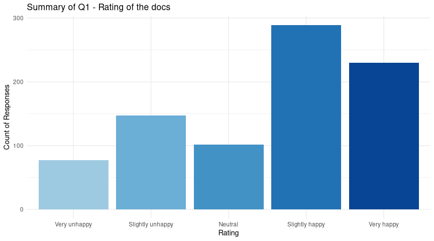
That’s pretty good! The “happy” ratings dominate - and there are over 900 responses to this survey, so that’s reassuring. We need to view the rest of this blog post in this light - users are not unhappy (in general) with our docs! So where you see negative scores in the next sections, that’s relative to other users. A section of the community might be less happy, but they are not unhappy.
Section 2 - Stratified satisfaction
Having looked at the overall picture, we also want to dive into some different ways to group the responses (strata) and see if we can detect anything interesting when comparing them to each other. In other words, are we meeting the needs of all the various types of people who might visit our docs?
There’s quite a number of ways we could break down the responses into interesting groups, so we’ll pick just a few for today:
- The
goalusers had when visiting the docs - are some goals under-served? - The
rolea user has when using Ansible - are some types of user less happy? - The
timea user has been using Ansible - are newer/older users different?
The first two are (hopefully) self-explanatory. The last, time, was actually
asked in two ways on the survey - we asked “How long have you been using
Ansible?” and “What is your experience level with Ansible?”. It turns out these
are highly correlated, which means we can drop one safely from the analysis - I
chose to keep time and drop experience.
OK, so let’s have a look at these. We’ll start with goal…
Goal of a Docs visit
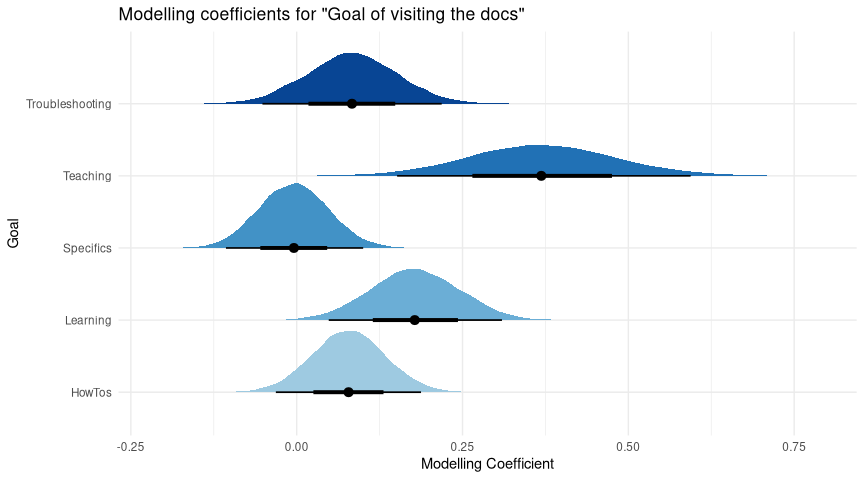
This is a modelling coefficient plot and there’s going to be a few of these,
so let me take a moment to give some context:
- Firstly, note the lack of “Other” as a category - it’s not missing, but instead it’s the “reference level”. The graph compares each goal to the “Other” responses - e.g. are users who chose “Troubleshooting” happier or unhappier, on average, than the those who chose “Other”?
- For each category, we use stats to model the effect of goal on the rating a user gives our docs. This will be an estimate of the real-world effect.
- Then we simulate this many times, so the estimate of these effects will vary each time. So, the plots show where those estimates fall - and where they peak, we have the most confidence.
- These are differences, so if a particular category gets a score of 0, that
means it has the same chance of giving a particular rating as the reference
level. The more positive, the higher the likelihood of getting a good rating,
and similarly the more negative, the lower the chance of a good rating.
To use an example, if I repeatedly offered fish & broccoli to my cat, and used fish as a reference level, then I’d get a single curve for “Broccoli” (not for Fish, it’s the reference) and I’d expect it would be strongly negative, and quite narrow - I’m confident he prefers fish!
So, now we can use that context to understand what we’re seeing here:
- All the goals we listed explicitly were more likely to be positive, except one.
- The “Looking for HowTos” and “Troubleshooting” had some plausible overlap with zero, but they are more likely to be slightly positive.
- “Learning about Ansible” and “Teaching Ansible to other” were strongly positive, but small in sample size.
- That “worst” category was “Looking for specific module/plugin docs”, at exactly 0 - no different to “Other”.
If you’re confused, it’s only because you’re paying attention - this is information-dense stuff. We can broaden our understanding by looking at the same model a different way - so we’ll sample some hypothetical survey results from it. This is what the model thinks people would say given the data we have, within each category. So the points represent our best guess of what a survey of only that category* would report, and the bars tell you how sure we are of that:
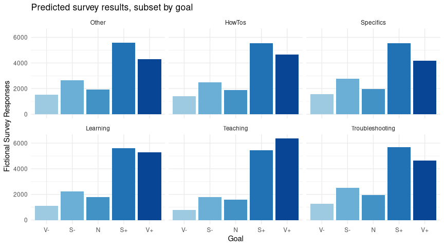
(Note I’ve coded the responses as “Very Unhappy” -> “V-” and so on so that they fit nicely in this smaller image format).
Take a look at the y-scale, we’re simulating thousands of survey responses here. If you look closely, you’ll see that “Specifics” has a notably smaller “Very Happy” bar, and in fact looks identical to the “Other” plot, which suggests that across the board we’re not really meeting user needs in that area. Let’s park that for later, and move on.
Role of an Ansible user
We asked people what role they have when using Ansible. There were some issues with this question - notably 1) we forgot to include “DevOps” as an answer, which many people reminded us of by using the “Other” box, and 2) we didn’t make it multiple-answer, so those of you with many hats were forced to choose. We’ll be improving this next time!
With this in mind, I could have spent ages trying to construct a “DevOps” answer from the “Other” data, but this felt error prone. Instead, looking through the answers to “Other”, it became clear that this was a very varied group - DevOps, students, legal people (!), managers, and so on. This made it an excellent reference level for something could otherwise have been tricky to work with.
As with goal we’ll start with the modeling output:
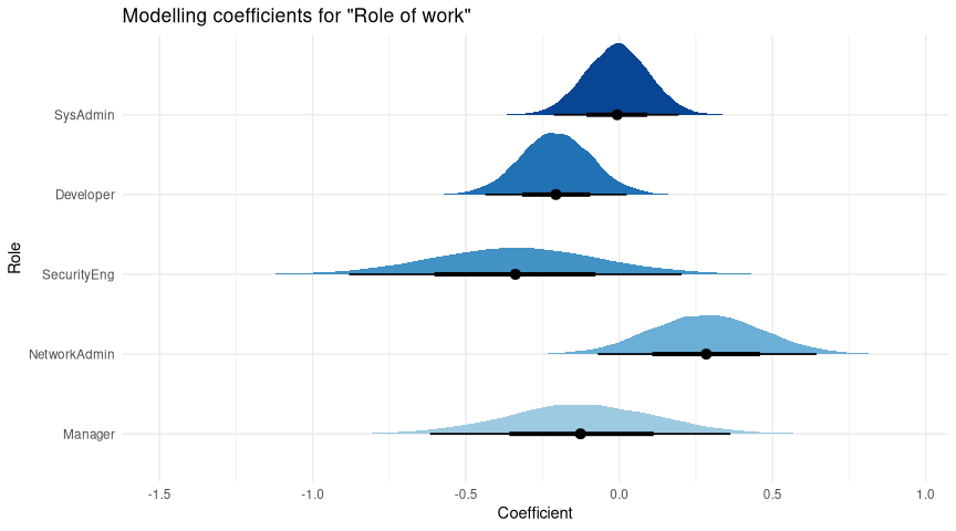
Again, let’s dig into this:
- The wide range of possible coefficients for Manager, SecurityEng, and somewhat for NetAdmin is because we have only a few responses for each of these - there are many plausible values for the “true” effect in these groups.
- Compared to reference, we seem to be doing well for SysAdmins (close to zero) and NetAdmins (strong positive)
- SecurityEng, Managers, and (especially) Developers are all negative, suggesting we’re not serving them as well.
Let’s predict responses again, so we can get an idea of what that might translate to a hypothetical survey of each group:
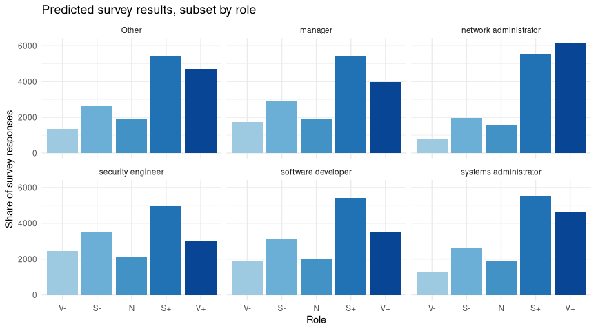
I think we can relax a little - note how in every case (even SecEng, the unhappiest group in modeling), the largest share goes to “Slightly Happy” or better. Broadly, there appears to be no single group that is very unhappy with the docs.
The strongest result here is the comparison of Devs and Sysadmins - they comprise the largest numbers of responses by far. It’s interesting that Sysadmin matches Other (which has a lot of DevOps answer in it, recall) but Devs are a bit lower. I’ll come back to this in a moment.
Experience of an Ansible user
Finally we looked at how long a user has been using Ansible. This graph should need no introduction by now:
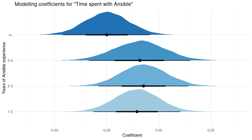
So what do we have?
- 0-1 years, the newest users, are our reference category.
- All the other categories are below zero.
- Most have some chance to be around zero - we’re not confident that these are definitely worse than new users.
- The most experienced users (4+ years) are quite a bit lower - we’re confident there’s quite a drop in docs satisfaction there.
One last time, let’s predict a hypothetical survey of these categories:
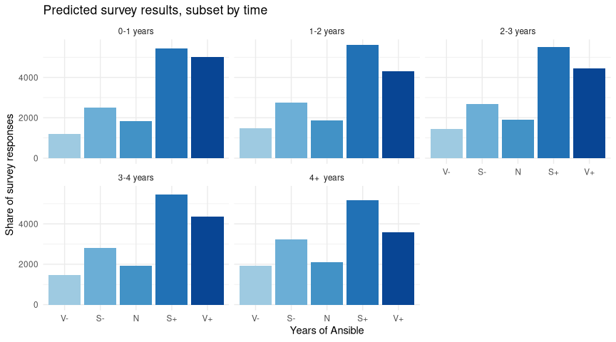
As before, we can see that the drop in ratings comes from lower “Very happy” ratings - the “Slightly happy” responses don’t actually vary much from group to group - reassuring!
Qualitative views of Satisfaction
So we find a slight drop in satisfaction in all 3 areas - goals (Specific docs), roles (Developers), and experience (4+ years). It seems to me that these are related, as it’s plausible that both more-experienced users, and/or development-focused users are more likely to be trying to find docs for a specific thing. By contrast, newer users are more likely to be looking for general docs, and sysadmins are often focused on rollout & troubleshooting, which seem better served.
We can actually see this one other way! We asked the question “How can we improve the docs?” as a free-text response. It’s not easy to summarise many hundreds of text responses, but here’s my take….
Suppose we count each word (ignoring filler like ‘and’, ‘so’, ‘the’, etc), and take the most frequent (I picked 100). Suppose we then look up the docs rating for each response, and give it a number from 1 to 5 (5 = very happy) - now we can calculate a mean score for each word. We can then plot that - score vs frequency - and see if any themes fall out of it:
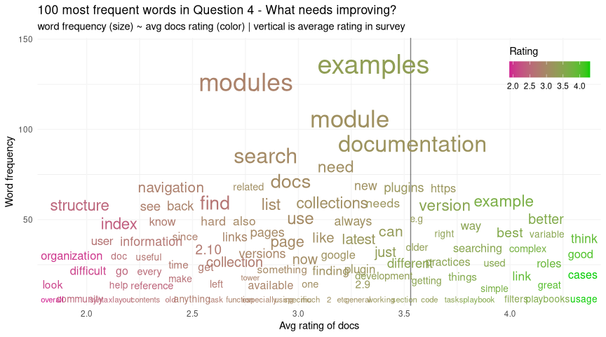
I’d focus on the lower left here - these are words that are frequent enough to make the top 100 words, but that people felt strongly enough about to give us a lower rating.
Looking there, we see a theme - words like “index”, “structure”, “reference”, “organization”, and “difficult” suggest to me that our idea around certain types of users looking for specific information is an area we’re not serving so well.
Section 3 - Contributing to Docs
Another area of interest is GitHub, and in particular the Edit on GitHub links
on the docs pages. The split to collections caused headaches in many areas, and
this was one of them. Making that link to the right collection was looking hard,
so it’s right to ask if it’s actually needed - is anyone using it?
We started with a simple Yes/No “have you contributed to the docs?” question, and 11% of users had! That’s pretty good, given the size of the community, although we must recall that all surveys are biased (in this case, the most active users are also the most likely respondents). Still, not bad.
We then asked if those 11% had used the Edit on GitHub links from the docs
pages - that resulted in an nearly-even 51%/49% to “Yes”. So, it seems that this
feature is useful, especially if we can get more people contributing.
In order to do that, we need to know what’s stopping contribution. For the 89% who said they had not contributed - we asked an open “Why not?” question. I’ve prepared another plot of frequent words vs score to see what we can find out about the replies:
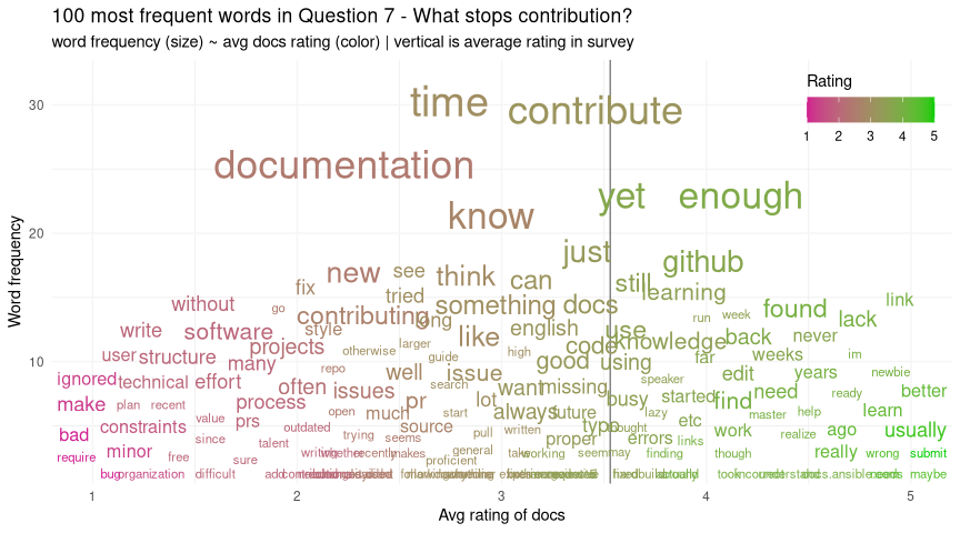
This time I will focus on the top of the plot - these are the most common words by far, and occur across a range of both happy and unhappy ratings, so they affect many types of users. Those words are things like “time”, “enough”, “know”, “new” - and indeed if we were to sample a few comments, we see things like “I don’t have enough time”, “I’m too new”, “I don’t know enough yet”.
We can’t fix people not having enough time, but it is encouraging that this is among the top reasons - I’d be worried if our top words were things like “ignored”, “process”, “difficult”, etc, which would point to structural issues in our contribution process. Instead, we perhaps need a bit of marketing to remind people that all contributions are welcome, no matter how small, or how new you are, but that’s about it.
Section 4 - Conclusions
Phew, another long post. Well done for reading it (or for hitting END, I’m not fussy).
To summarise, it seems to me like the big result here is that the structure of the docs (at the time of the survey, Dec 2020) is a potential cause for concern among people who are searching for specific things, but that otherwise most types of user are pretty happy. Improving the structure is unlikely to make anyone unhappy, so I’d suggest this as a place to improve.
It’s important to note that while these folks are less happy with the docs, they are not unhappy (again, in aggregate - not trying to ignore the people who are saying they’re not happy). The docs are doing good work, it’s just that (as ever) there’s room for improvement. It’s satisfying that the survey helps us to see where that effort might be well spent.
Additionally, we see some evidence that the contributing process to the docs on GitHub is mostly OK, with key reasons for not contributing being largely out of our control. Perhaps we could make the message that small contributions are very welcome a bit stronger?
This post has turned out to be long, so I haven’t included a Methodology section, but I’m happy to share! If you want details on that, do get in touch! Otherwise, see you next time!