FAQ on Ansible Community Collections Bubbleplot
In Issue #6 of the Bullhorn I showed off a bubbleplot of contributors within the Ansible Community Collections. That raised quite a few questions, so I’ll answer them here!
This is going to an “FAQ” style post, so feel feel to page down to see the questions. First though, here’s a refresher of the image:
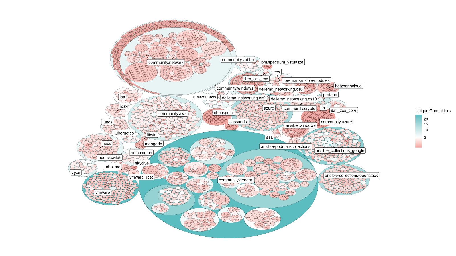
Community contributors to Ansible Collections
Funky! But also, perhaps, hard to read. So let’s get down to it!
What am I looking at here?
This plot is based on an idea from Jeff Geerling at the recent Ansible Contributor Summit in which he suggested a “heatmap of activity” across the Ansible Community Collections. I liked the idea, and this is the result.
Broadly (details below) you’re seeing a small circle for every module, coloured by the number of unique contributors to that file. The result is a colour map of low-to-high numbers of contributors.
What is the actual data set?
So we start with a list of Git repositories for our Collections, since that means we can just clone them, rather than dealing with APIs, rate limits, etc.
From there, we clone each repo and read the git-log, and since a commit can touch multiple files, we un-nest that so we have a list like:
| sha | author | file_changed | repo |
|---|---|---|---|
| 12345 | me | /path/foo.py | ios |
| 67489 | you | /some/else.py | quux |
We can then group by (repository,file_changed) and count the number of unique
authors for each file.
Crucially, we hang on to the list of names, and repeat the process at the parent directory, and again above that, and so on up the tree. That means we can also calculate the number of authors in each directory/repository.
What do the colours mean?
The intent was to highlight “activity” in some way, and I decided that “bus-factor” was an adjacent concept which we could fold in.
So, I (arbitrarily) picked 5 contributors as a good “middle value” - above this, and we consider ourselves safe from people departing the project; below this, and we’re at risk of having no maintainers. I then picked a colour scale - red for below 5, blue for above 5, passing through white at exactly 5.
So, where you see blue, it’s lots of folk, where it’s red, not so much!
What do the circle sizes mean?
In theory, the circle sizes are related to the number of commits to that file (not authors), but in reality, the circle-packing algorithm has quite a bit of leeway here. Given most of the files will only have a few commits (the mean is 3.6 commits, standard deviation is 2.9) most look the same, but you can see some variation.
How are the directories different to the files?
Recall I said we keep track of the list of authors per-file? That means we can
repeat the calculation at each parent level. So if A & B contribute to
dir/file1, and B & C contribute to dir/file2 then each file has 2
contributors, but the directory dir has 3.
This leads to some interesting results. Compare vmware which has a strong
diverse group of contributors (26 actually) to ansible.windows which has 3.
The visual impact of this is very handy when discussing the breadth of our
community!
Couldn’t you just make a table?
Absolutely, and if we were trying to figure out specific things, I would have. But the goal here was a general feel for the situation, and a table doesn’t have the same impact. Tables reward careful study, yes, and are probably more informative too, but it doesn’t get the same attention from around the community. I want to be sure you excellent folk are well-represented!
Why is the list of repos not the same as X?
I got this one a few times, asking why it wasn’t “everything in base” or other such lists. Simply, that didn’t occur to me - but in any case, I wanted to keep consistency with my other tools, which use the list found on our Collections momentum tracker. You can contact me, or Gundalow, if you want to add your collection on the list.
Could you use this for other things?
For sure! We have both the size and colour dimensions to play with, and possibly the alpha (transparency) too, so we can convey a lot of information here.
When I have a moment, I definitely want to try “time since file was last touched” which is another way of looking at “activity”. I’d also like to fold back in the “staff” vs “non-staff” axis that I showed off back in December as I think the interplay of these two is interesting. Diversity would be another one (but calculating scores for that is notoriously hard and full of bias…).
If you have any other ideas for bubbleplots, do get in touch!
Fin
That’s all for now, folks. I hope it was informative - see you next time!